ShopDreamUp AI ArtDreamUp
Deviation Actions


Suggested Deviants


Suggested Collections


You Might Like…


Description
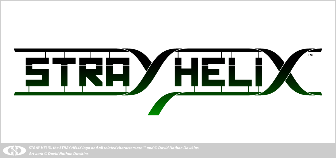
I decided my early STRAY HELIX™ logo was too fanciful and didn't really embody what the forthcoming manga is going to be all about, so I decided to take the logo back to the drawing board.
Originally I intended for the logo to look more like this - incorporating a DNA helix directly into the design - but I had difficulty making it work, and some of the people who saw my early attempts at the logo complained about not being able to read what it said.
Now I'm a little bit more savvy as a graphic artist/designer, I think I've pulled it off, although now I'm concerned the logo is too basic for it's own good.
I still don't think it scales down very well... so I'll also have to revisit the "Tripupil Eye" Logo to at some point so I can have a scalable logo/branding motif synonymous with the main STRAY HELIX™ logo.
Original Logo.
Do not claim this logo or artwork as your own.
Do not copy, alter or reproduce this logo or artwork in any way.
STRAY HELIX and all related characters are ™ and © David Nathan Dawkins.
Artwork © David Nathan Dawkins.
Image size
1170x550px 27.46 KB
© 2010 - 2024 DoNotDelete
Comments10
Join the community to add your comment. Already a deviant? Log In
this logo seems better its missing something though.